Reinventing a life sciences blog with a typography-led approach
About the Project
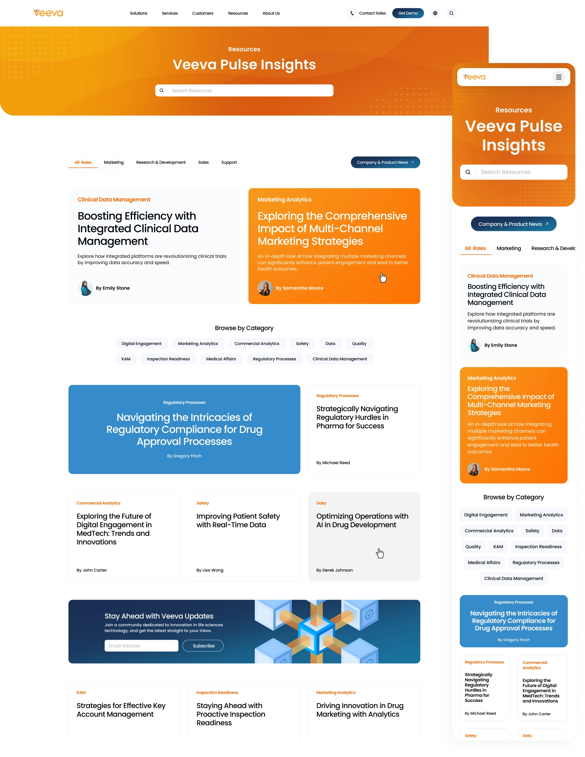
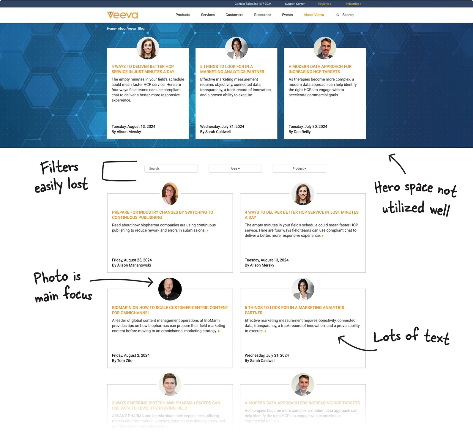
The Veeva blog, burdened by its existing extensive library, faced significant challenges in user engagement and visual appeal. The original setup, devoid of visual hierarchy and compelling imagery, made it difficult for users to navigate and engage with the content effectively. A redesign was initiated to not only enhance the blog’s aesthetic and functionality but also address the logistical challenges posed by the need to rapidly update and publish new content without the delays of graphic design.
Challenges
- The vast library of articles lacked accompanying visuals, a standard feature in modern blogs that helps attract reader attention.
- Since creating graphic thumbnails for each blog would create friction between writing and posting, a layout without the need for design support was necessary.
- The original design lacked visual hierarchy, which led to a monotonous user experience, with critical content and navigation often overlooked. This gave no ability to call out articles of higher importance, and diminished the potential impact of key content.
Original Resource Page
Design Strategy
Typography-Driven Design
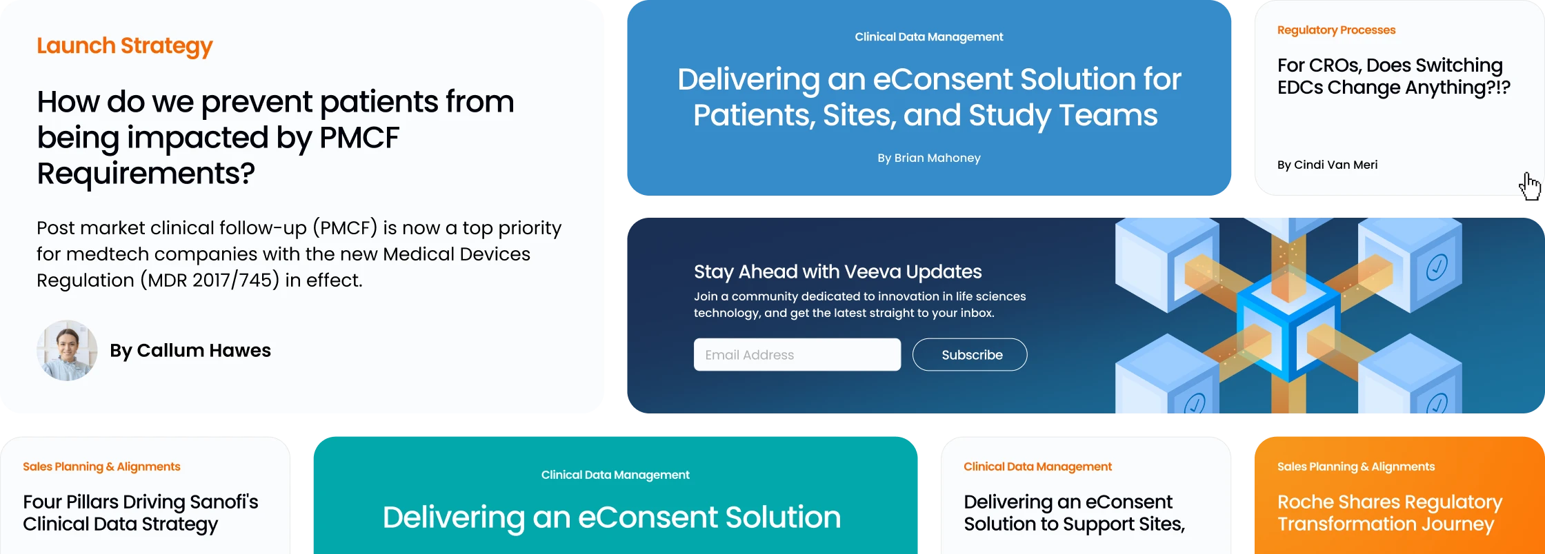
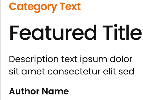
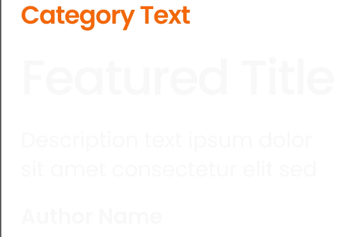
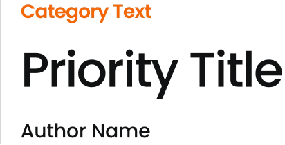
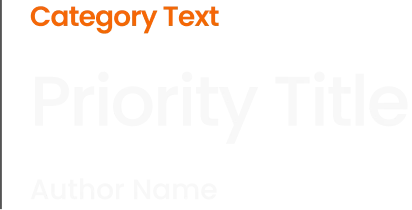
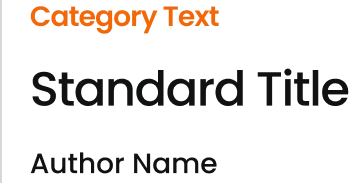
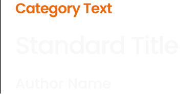
Addressing the challenge of the existing library of text-heavy posts without included imagery, the redesign focused on innovative typography to captivate the reader’s attention. The large, bold typefaces helped enhance readability and draw the eye, compensating for the lack of images, while limiting the presented content to not overwhelm the user with information.
Dynamic Sizing
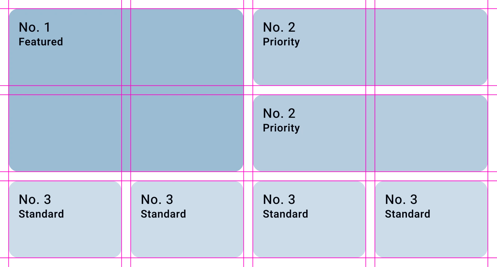
Maintaining simplicity while avoiding monotony was essential. The implementation of dynamic sizing for blog cards introduced a visual rhythm to enhance user engagement, while also giving the ability to highlight specific articles deemed more important. This design choice not only keeps the user’s interest but also guides them towards key content, making the user experience both intuitive and informative.
Enhancing Content Discovery
The redesign introduces three distinct enhancements to empower users to tailor their content discovery:
- First, included in the hero banner is a large search bar, immediately inviting user to interact and engage.
- Second, a streamlined navigation helps to filter posts by user roles, such as marketing and R&D, which speeds up the search for relevant content.
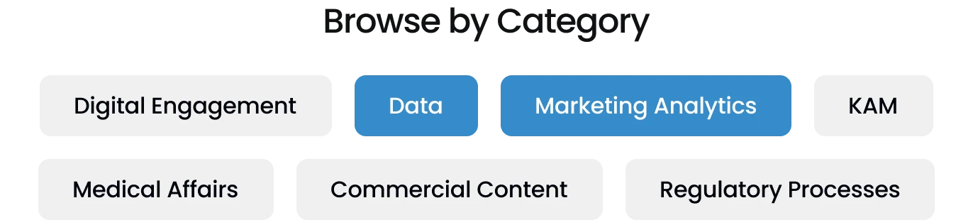
- Last, articles have been categorized based on interest giving the user the ability to filter even further to find exactly what they’re looking for with ease.
Subscription Integration
Recognizing the value of keeping readers engaged and returning, a subscription field was added seamlessly among the blog posts. This placement encourages blog update sign-ups without interrupting content exploration, subtly enhancing engagement and helping to expand the audience.