Giving a beloved doggy daycare a website as warm as its reviews
About the Project
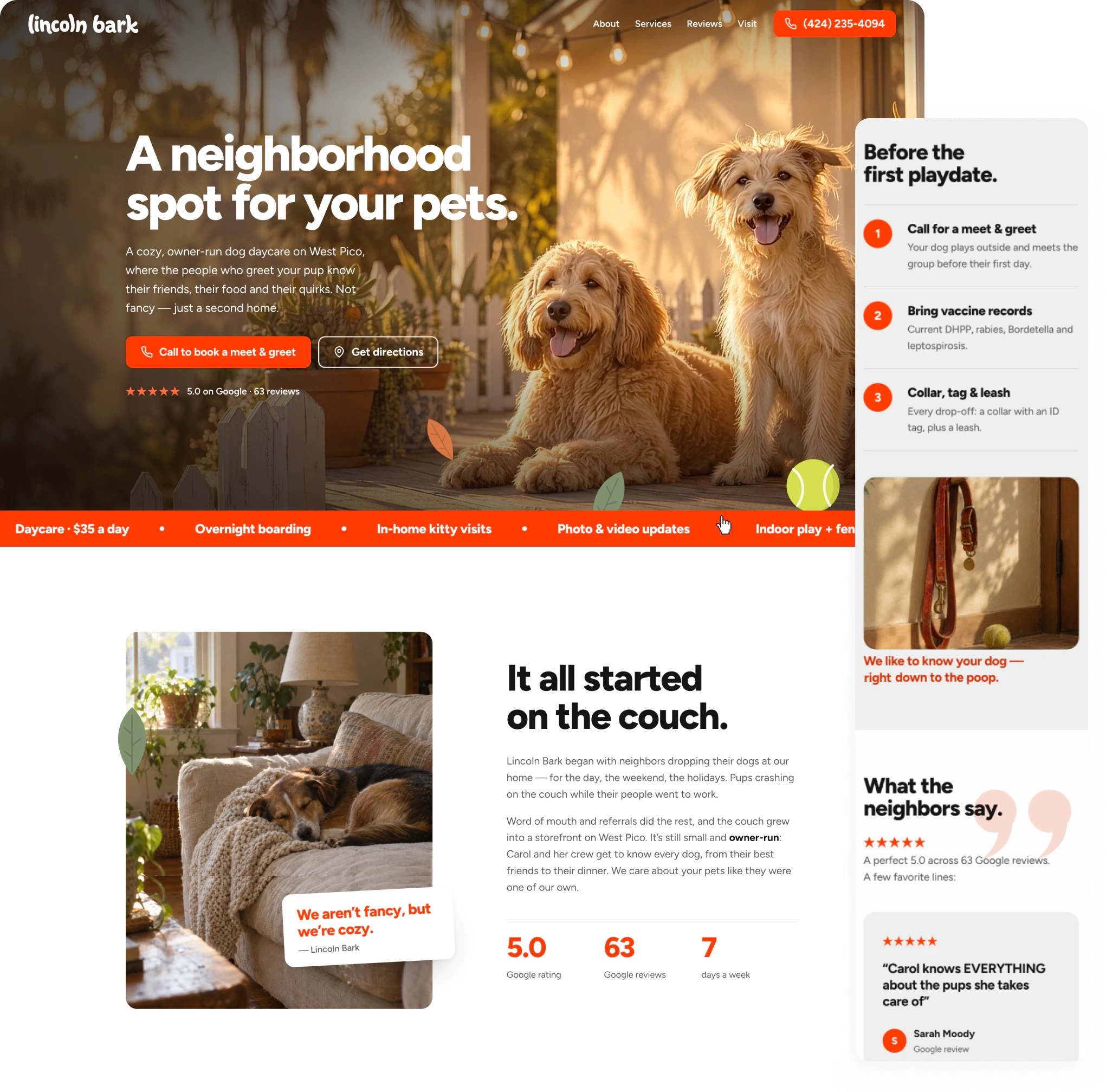
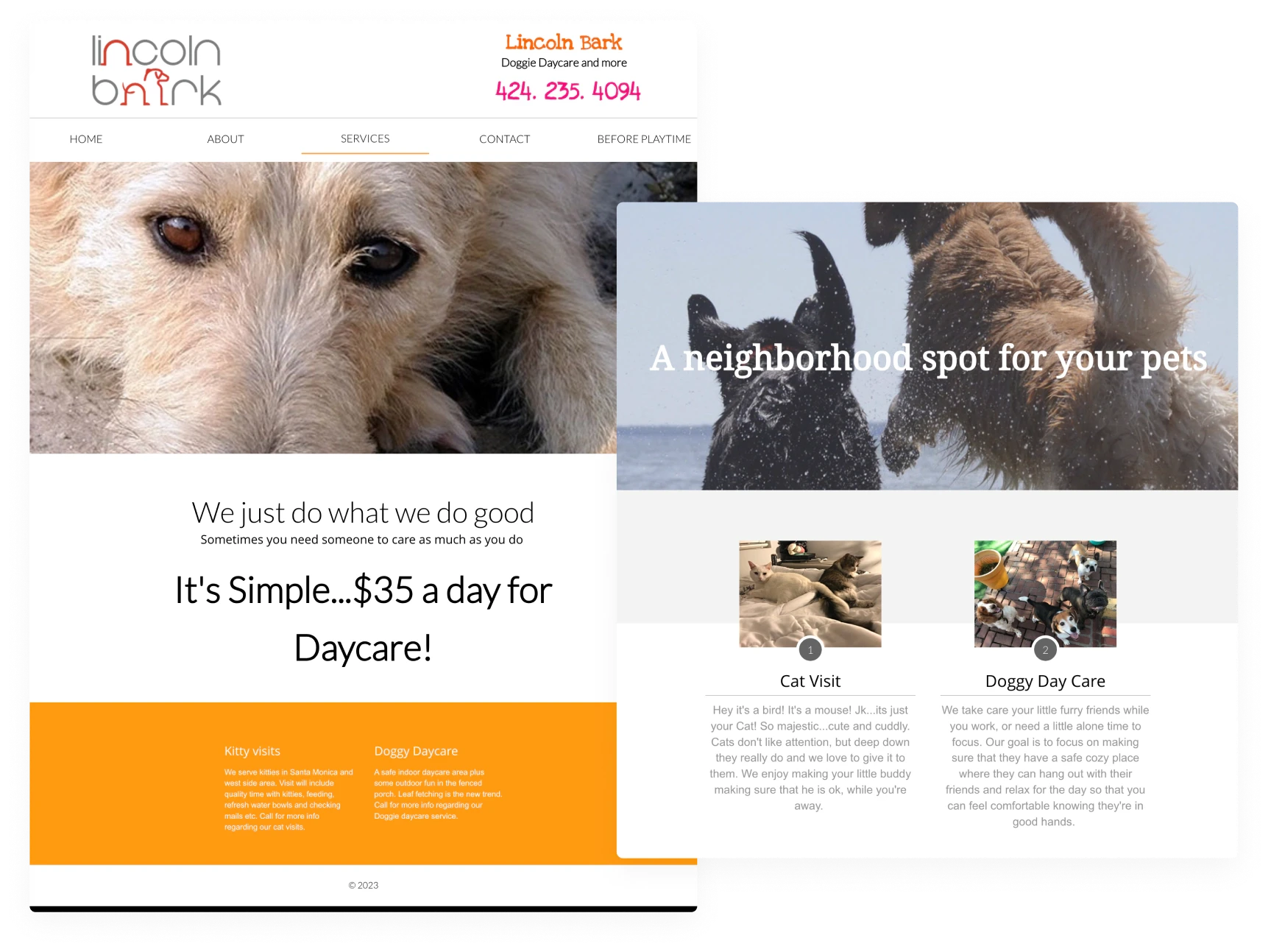
Lincoln Bark is a small, owner-run dog daycare in Los Angeles with great reviews and a loyal customer base. Their website told a very different story. Built on a dated template, it hid most of what made the business special: easy pricing, a perfect 5.0 rating on Google, and several different offerings. There were no hours, minimal mention of their services, no reviews, and little personality. The redesign set out to create a site that feels as cozy and personal as the daycare itself, while making it effortless for a pet owner to go from a stranger to another 5 star review.
Challenges
- The original site was dated with unorganized information, and a poor mobile viewing experience.
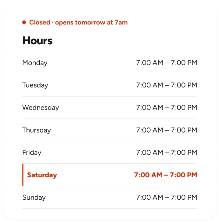
- Key details were missing entirely, including hours and some services, leaving visitors to call just to learn the basics.
- Stock photography and several unrelated typefaces didn’t reflect the business’s warm, owner-run personality.
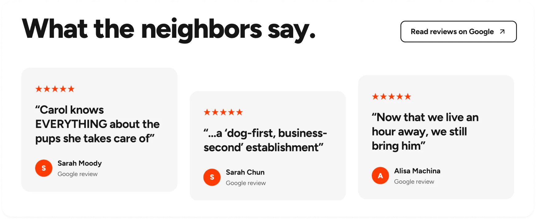
- An outstanding reputation lived only on Google, with no reviews or testimonials anywhere on the site.
Original Website
Brand Identity
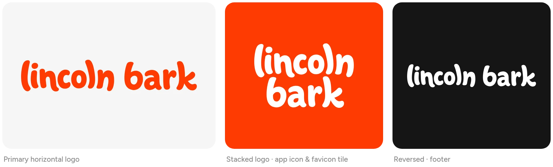
The brand was built beginning with a new bright and bubbly wordmark that encapsulated the energy of the business and the playfulness of canine clientele.
Color
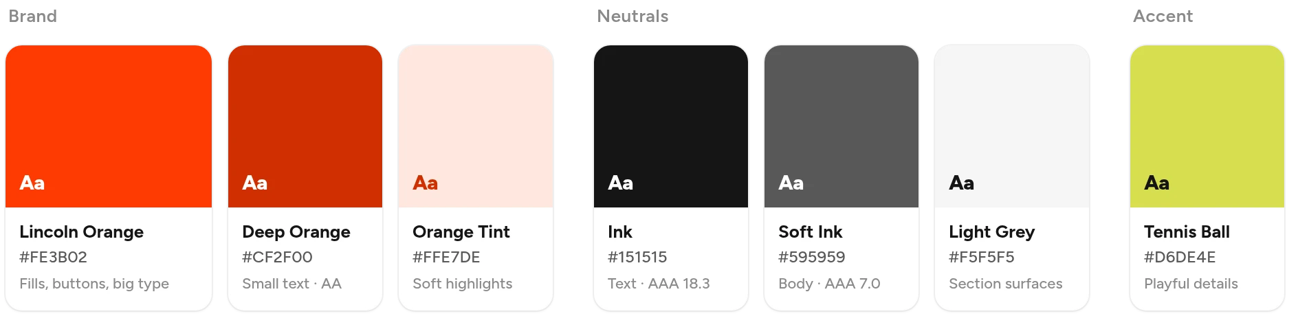
The palette was narrowed to one confident orange, paired with a near-black ink, white and light grey surfaces. A deeper orange keeps smaller text readable to WCAG AA standards, while a tennis-ball green shows up only in small, playful details.
Typography
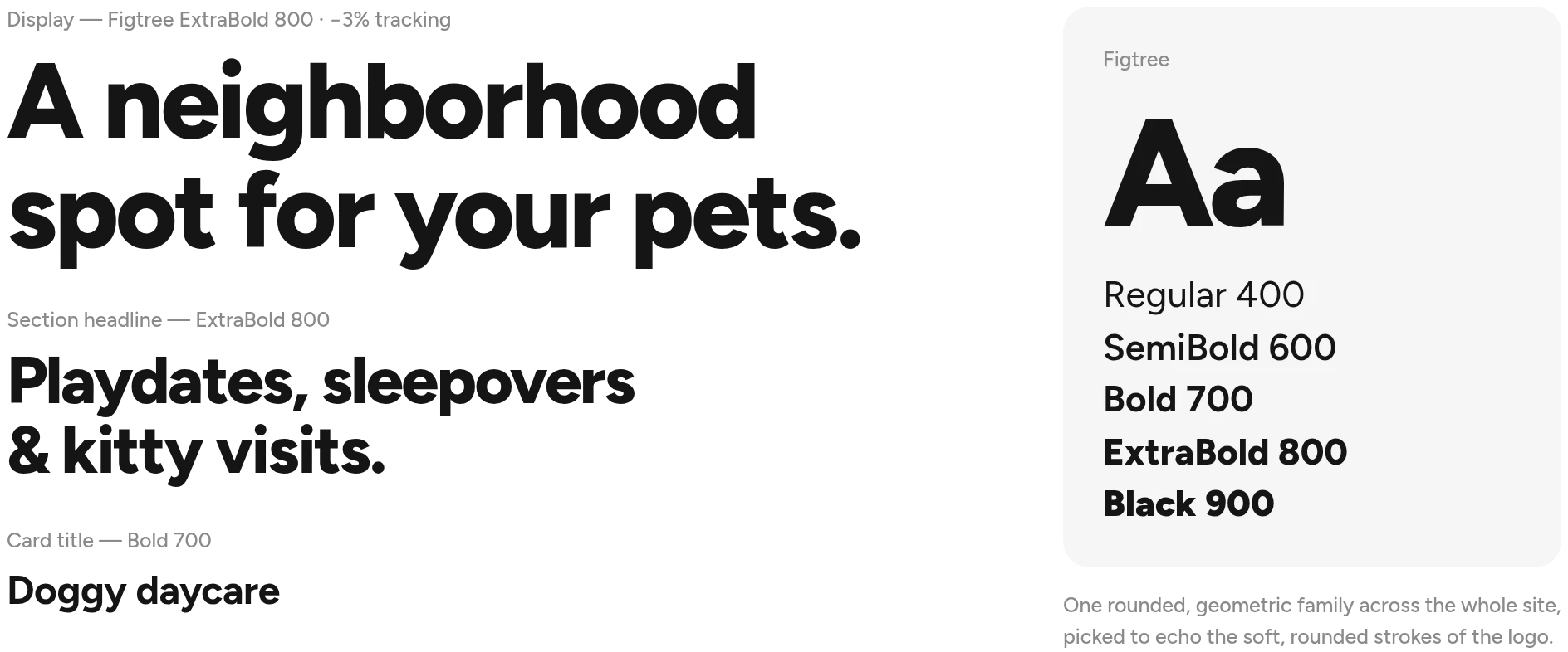
Four mismatched fonts were replaced with a single rounded, geometric family, chosen to echo the soft strokes of the logo. Heavy, tightly set headlines bring confidence and energy, while relaxed body copy keeps every section easy to read.
Imagery
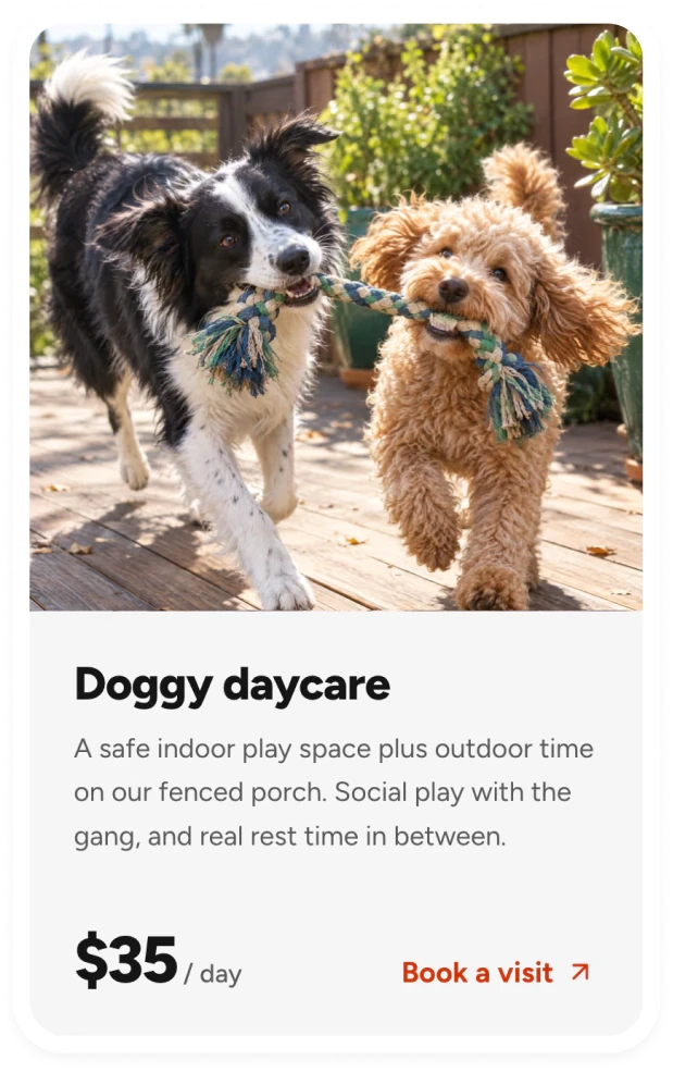
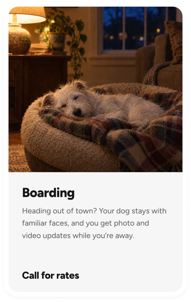
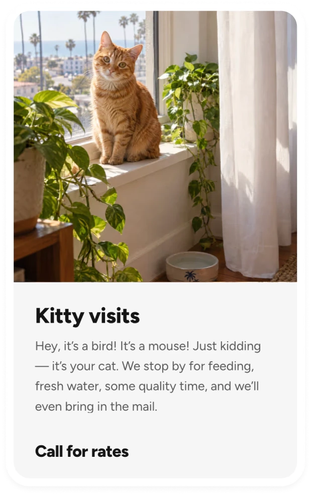
The imagery leans into warm, golden-hour light and candid, everyday moments: dogs mid-play on the porch, a pup napping on a well-loved couch, a cat sunning itself in the window. The goal was for the space to feel lived-in rather than polished, echoing the business’s own description of itself: “We aren’t fancy, but we’re cozy.” A slow, looping hero video of dogs lounging on the porch sets that tone the moment the page opens.
Structure & Experience
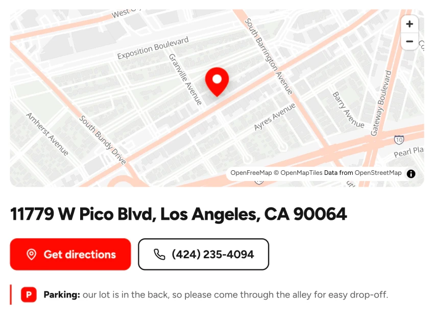
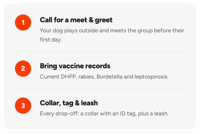
The original five-page site was condensed into a single, focused page that answers questions in the order a new pet owner asks them: what do you offer and what does it cost, how do I get started, can I trust you, and where do I go.
A Clear Next Step
Every “call for more info” was replaced with one primary action, booking a meet & greet, repeated at natural decision points. The phone number stays in the header at all times, becoming a simple call button on phones.
Services at a Glance
Lincoln Bark’s services are easy and straightforward, so they were shown that way with a simple three-card treatment. Daycare, boarding, and kitty visits are displayed front and center leaving no room for confusion.
Trust Front and Center
A perfect 5.0 rating is Lincoln Bark’s strongest selling point, so it now appears right in the hero and again in a dedicated reviews section. Short, real quotes from clients, each with a name attached, do the persuading, and a link leads to every review on Google for anyone who wants to read more.