Redesigning a medical technology website to be clearer, warmer and easier to navigate
About the Project
Veeva MedTech makes cloud software that helps medical device and diagnostics companies run clinical trials, stay compliant and bring products to market. The software had grown into a broad, modern suite, but the website still read like an older brochure: tinted stock photos, long paragraphs that explained the product instead of showing it, and the strongest proof, the companies that rely on Veeva every day, buried far down the page. With the main Veeva.com freshly redesigned, the goal was a site that felt at home in the Veeva family while standing on its own, and that helped visitors find the right product in seconds.
Challenges
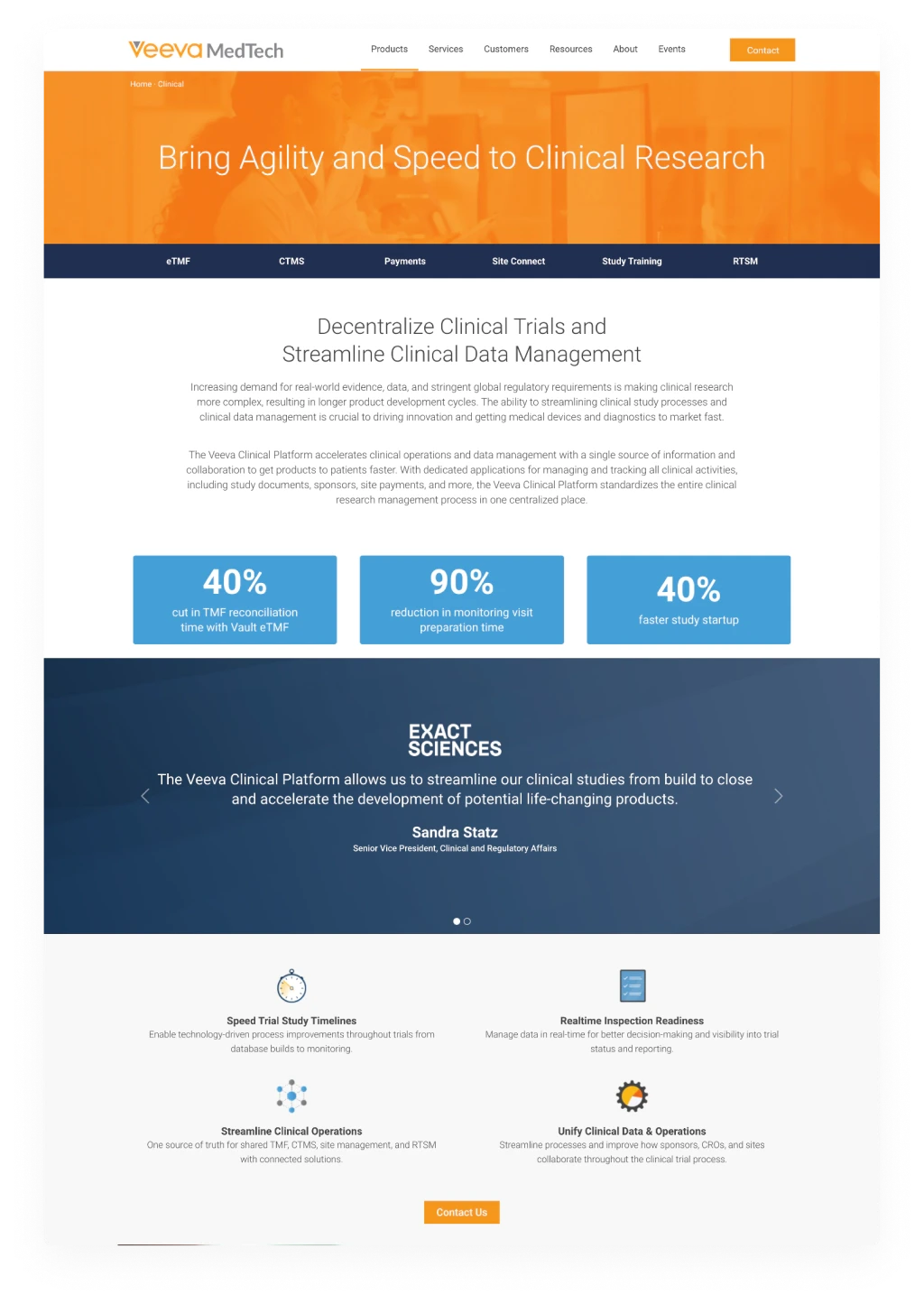
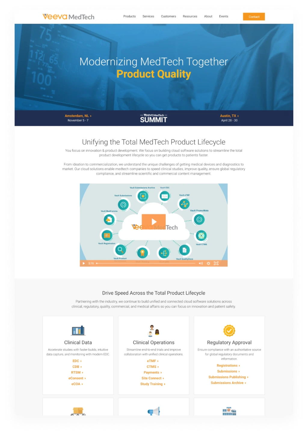
- Duotone stock photography and clip-art style icons made the site feel dated and generic next to the polished software it was selling.
- Each page type had grown on its own, so the homepage, solution pages and product pages didn’t feel like one site.
- Customer stories, metrics and testimonials were scattered and repetitive, instead of working together as proof.
Original Website
Visual Language
The new visual language trades the old site’s tinted photos and competing colors for a bolder, more focused look. It shares a foundation with the wider Veeva brand, but every choice was made so visitors could tell at a glance they were on the MedTech side of Veeva.
Imagery
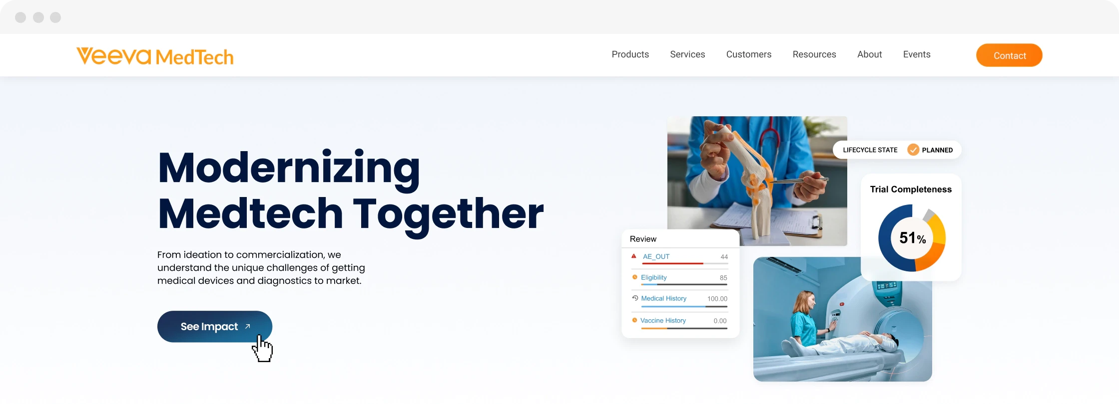
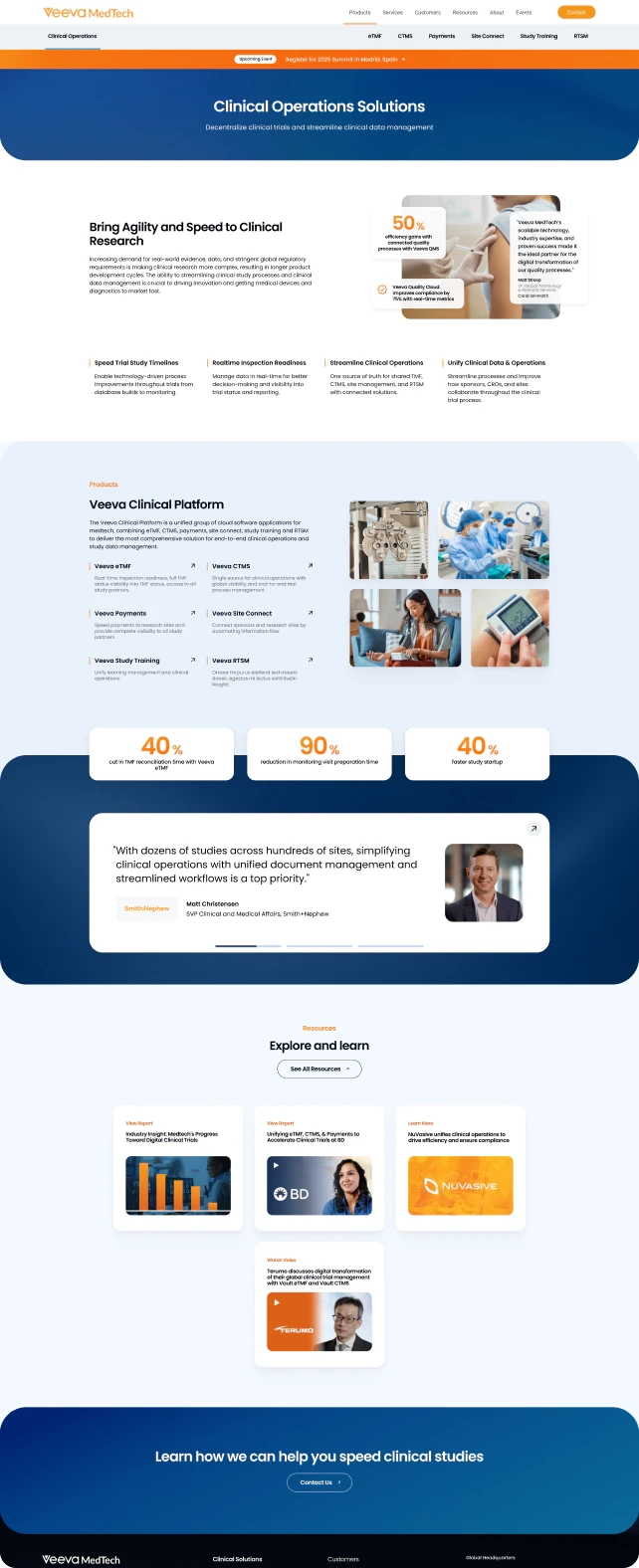
Tinted stock photography gave way to imagery that is used with much more intent. Photos show customer experiences, and they’re paired to tell the full story of a medical product: product shots and user interface stand for the early stages, while photos of finished devices in use show where all of that work ends up.
Product Prominence
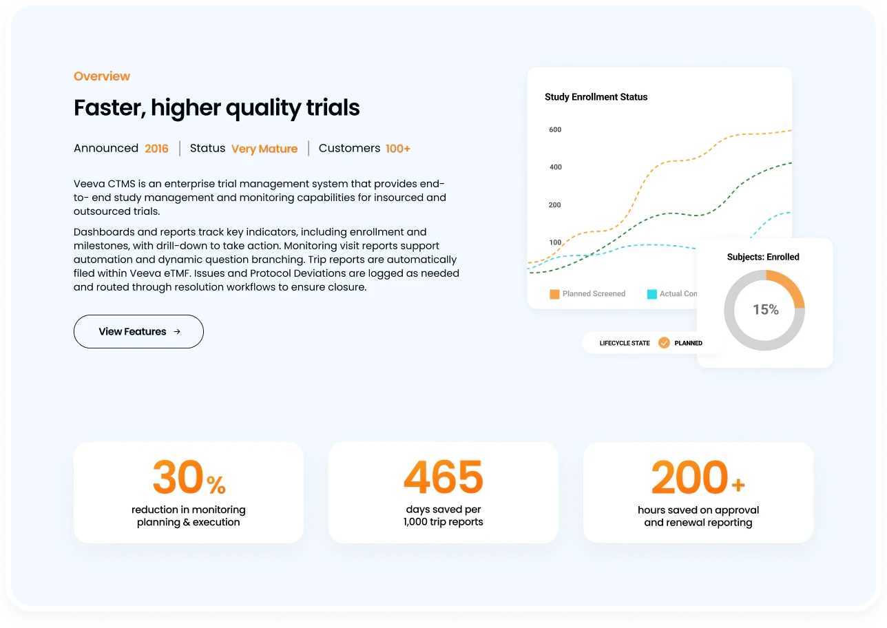
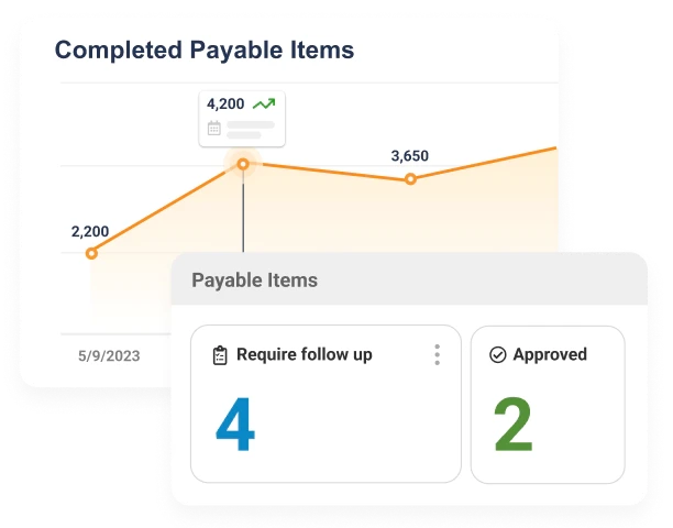
The original site described the software in paragraphs. The redesign shows it. Small, clean pieces of the actual interface are layered with photography throughout the site to give visitors an immediate, honest sense of what working in Veeva MedTech looks like.
Color
Veeva orange still plays a big role, carrying headlines, icons, buttons and key numbers. Alongside it, a royal blue takes on a much larger part than it does anywhere else in Veeva. It fills full sections of every page and sticks around as the clearest visual cue that this is MedTech.
Structure & Experience
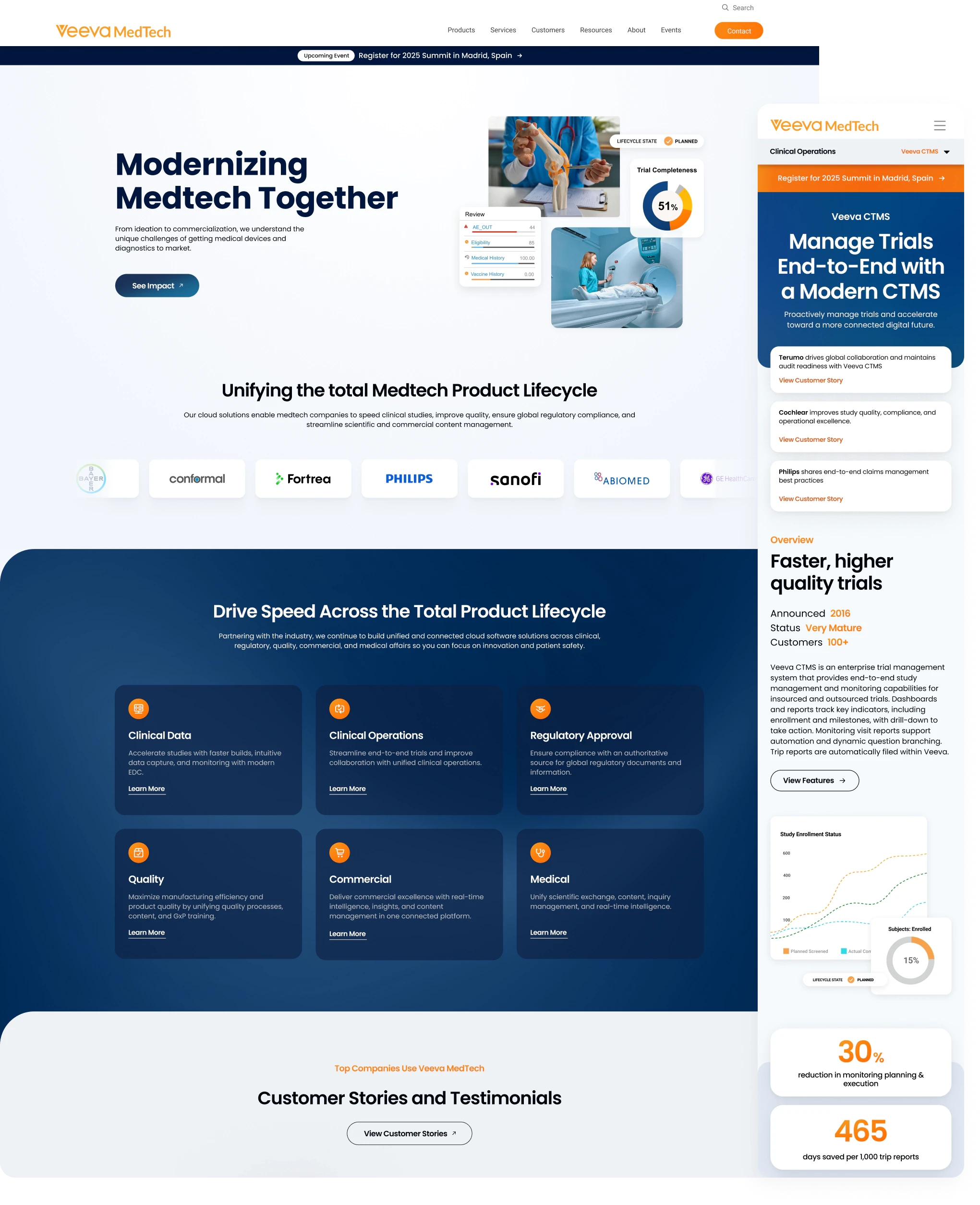
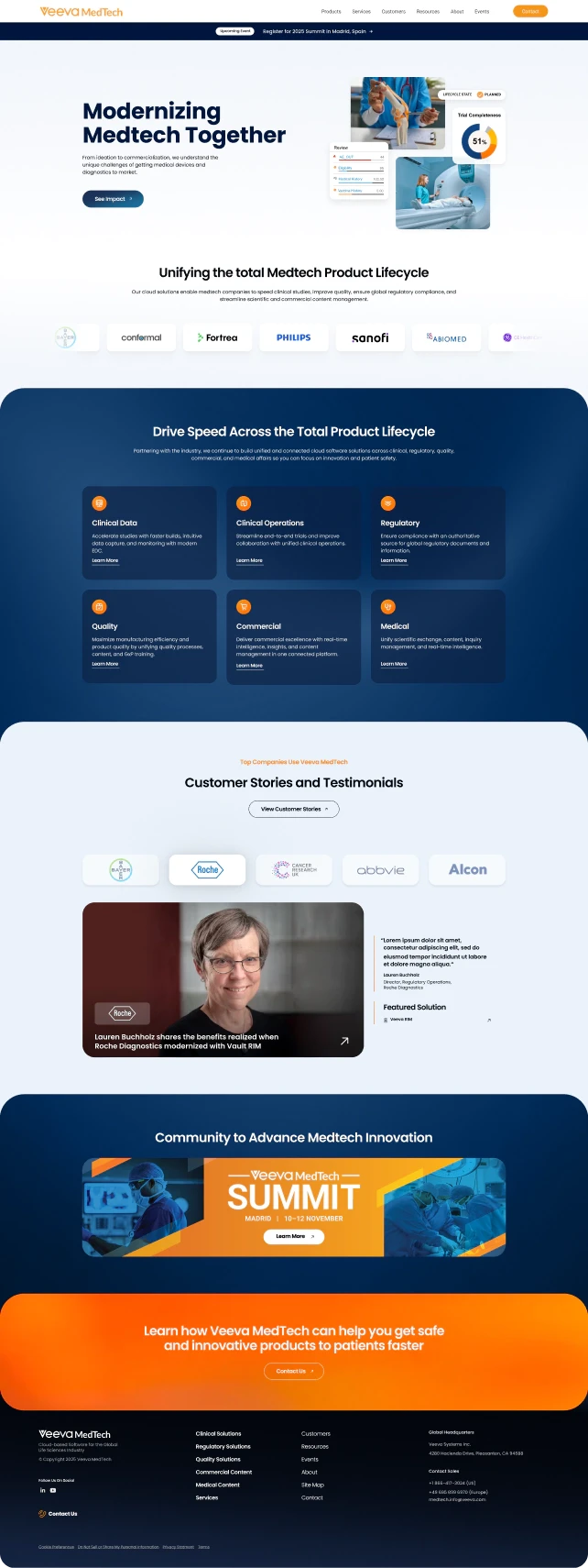
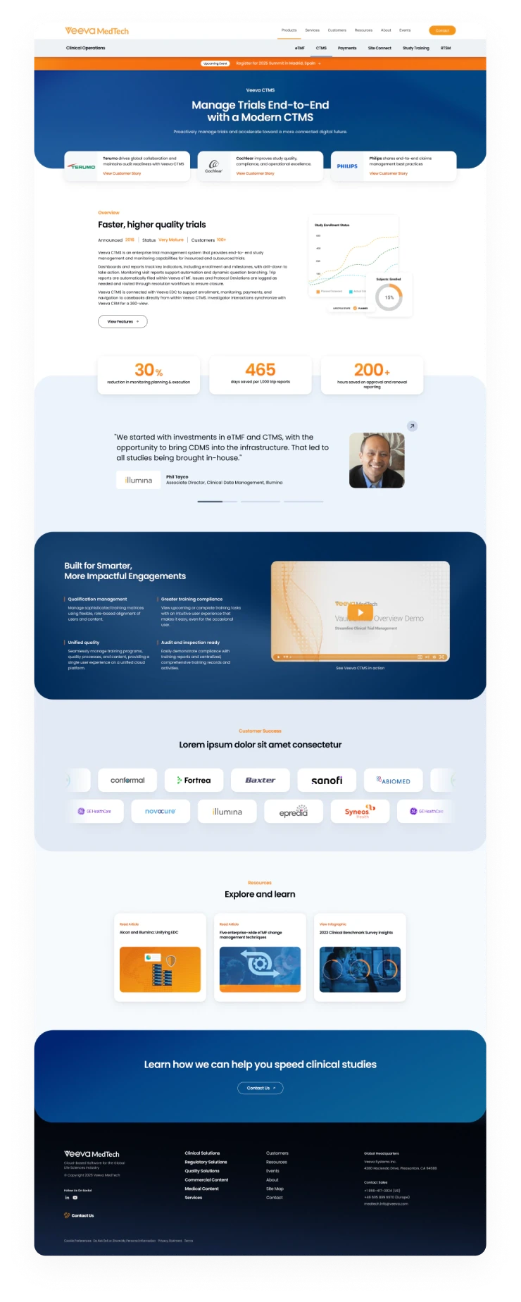
The redesign was built as a family of three page templates that share the same components, so every page feels like part of one site: a homepage that introduces the full product lifecycle, solution pages that group related products, and product pages that go deep on a single one.
Clearer Paths
On the homepage, six solution cards each once carried a long list of product links. Each card now has a short description and a single “Learn More,” and the detail lives one click deeper on the solution page, where it has room to breathe.
Easier Wayfinding
Solution and product pages gained a secondary navigation bar listing every product in the suite, so visitors can move between related products without going back to the main menu. A slim banner at the top of every page keeps upcoming events visible without taking over the hero.
Proof Where It Counts
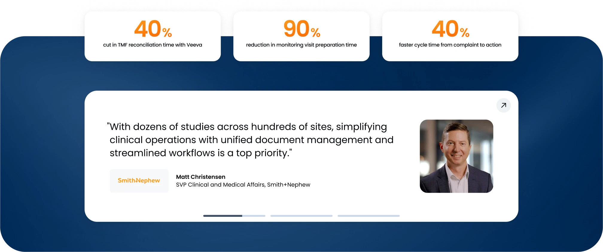
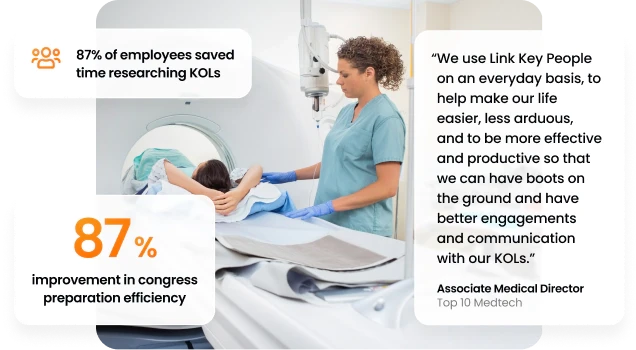
Veeva MedTech’s strongest argument is the companies already using it. Product pages now open with customer stories right in the hero, follow with clear headline metrics on simple white cards, and pair every testimonial with a real face, name and company logo. Rows of recognizable customer logos repeat the message across the site.